I totally agree that more diversity in art makes things more interesting, and I’m a big fan of bucking trends to make things unique. Art should be able to exist on its own merit, as the artist intended, divorced from what would make a better t-shirt. Even stepping out of art and into design, it makes me sad how many cars are grey, black, or white. Let’s get some variation!
But… This is a logo. It’s not a poster. It’s not a t-shirt or a building or a painting. It’s a logo. As such, there are some specific criteria that will make it better at being a logo. It needs to be instantly recognizable. It needs to be legible across a wide variety of contexts, sizes, mediums, and color applications. As a result, logos tend to be better if they’re simpler.
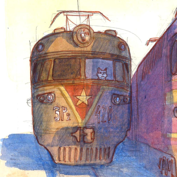
The AI output is an illustration because it uses things like shading, complex shapes, and shadows, etc… Can you use an illustration for a logo? By all means. In some situations, it’ll probably look nice. But at a certain size, it just won’t be recognizable, and then it won’t be doing the main job you want a logo to do — be instantly recognizable across as wide a set of scenarios as possible.
Also, to be clear, I’m not a fan of the logo on the left either. It’s not particularly imaginative, the highly variable line weight makes it feel in cohesive, and the details mean it probably wouldn’t work well at small sizes either.

I totally agree that more diversity in art makes things more interesting, and I’m a big fan of bucking trends to make things unique. Art should be able to exist on its own merit, as the artist intended, divorced from what would make a better t-shirt. Even stepping out of art and into design, it makes me sad how many cars are grey, black, or white. Let’s get some variation!
But… This is a logo. It’s not a poster. It’s not a t-shirt or a building or a painting. It’s a logo. As such, there are some specific criteria that will make it better at being a logo. It needs to be instantly recognizable. It needs to be legible across a wide variety of contexts, sizes, mediums, and color applications. As a result, logos tend to be better if they’re simpler.
The AI output is an illustration because it uses things like shading, complex shapes, and shadows, etc… Can you use an illustration for a logo? By all means. In some situations, it’ll probably look nice. But at a certain size, it just won’t be recognizable, and then it won’t be doing the main job you want a logo to do — be instantly recognizable across as wide a set of scenarios as possible.
Also, to be clear, I’m not a fan of the logo on the left either. It’s not particularly imaginative, the highly variable line weight makes it feel in cohesive, and the details mean it probably wouldn’t work well at small sizes either.